Featured Work
Tap a card to flip it and see the direction behind each piece.
 Tap for details
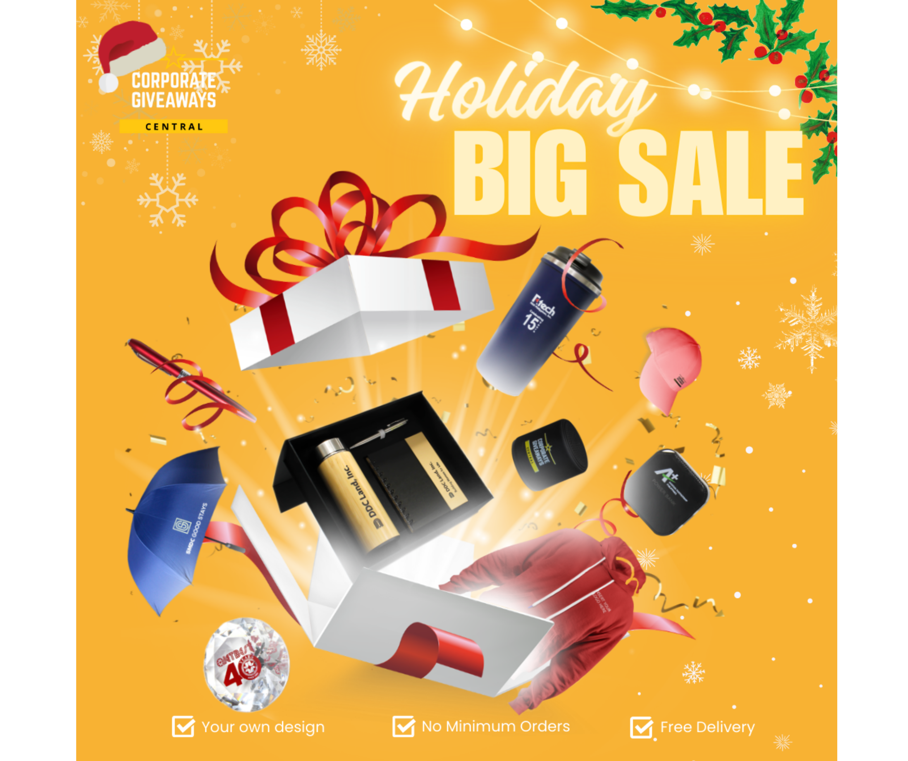
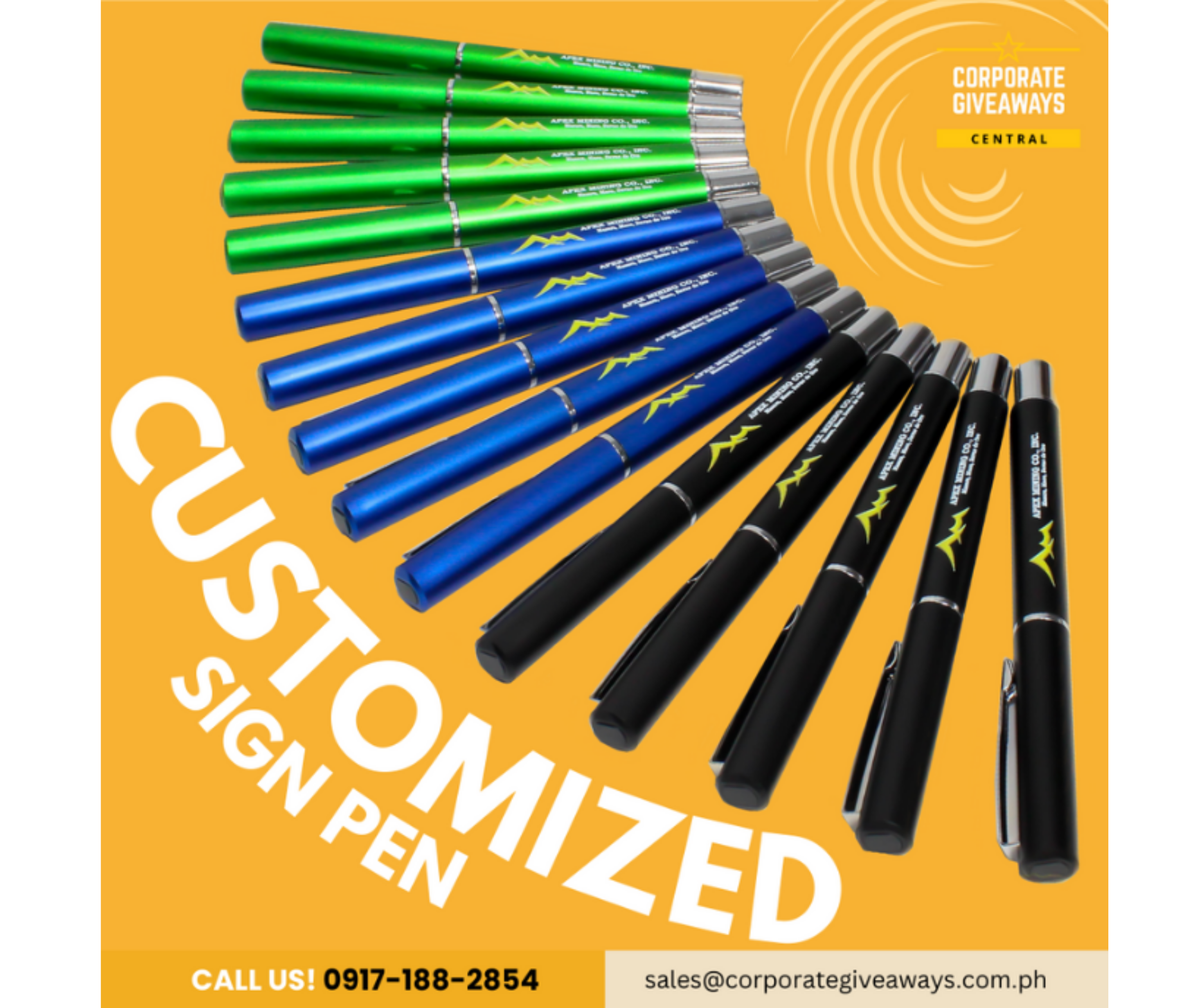
Corporate Giveaways Central — Holiday Big Sale
To promote the holiday sale while keeping the product lineup clearly visible, the ad was built around an exploding gift box concept — products bursting out, a Santa hat on the logo, garlands in the corner, a jolly script for "Holiday," and an oversized "BIG SALE" so the offer couldn't be missed.
 Tap for details
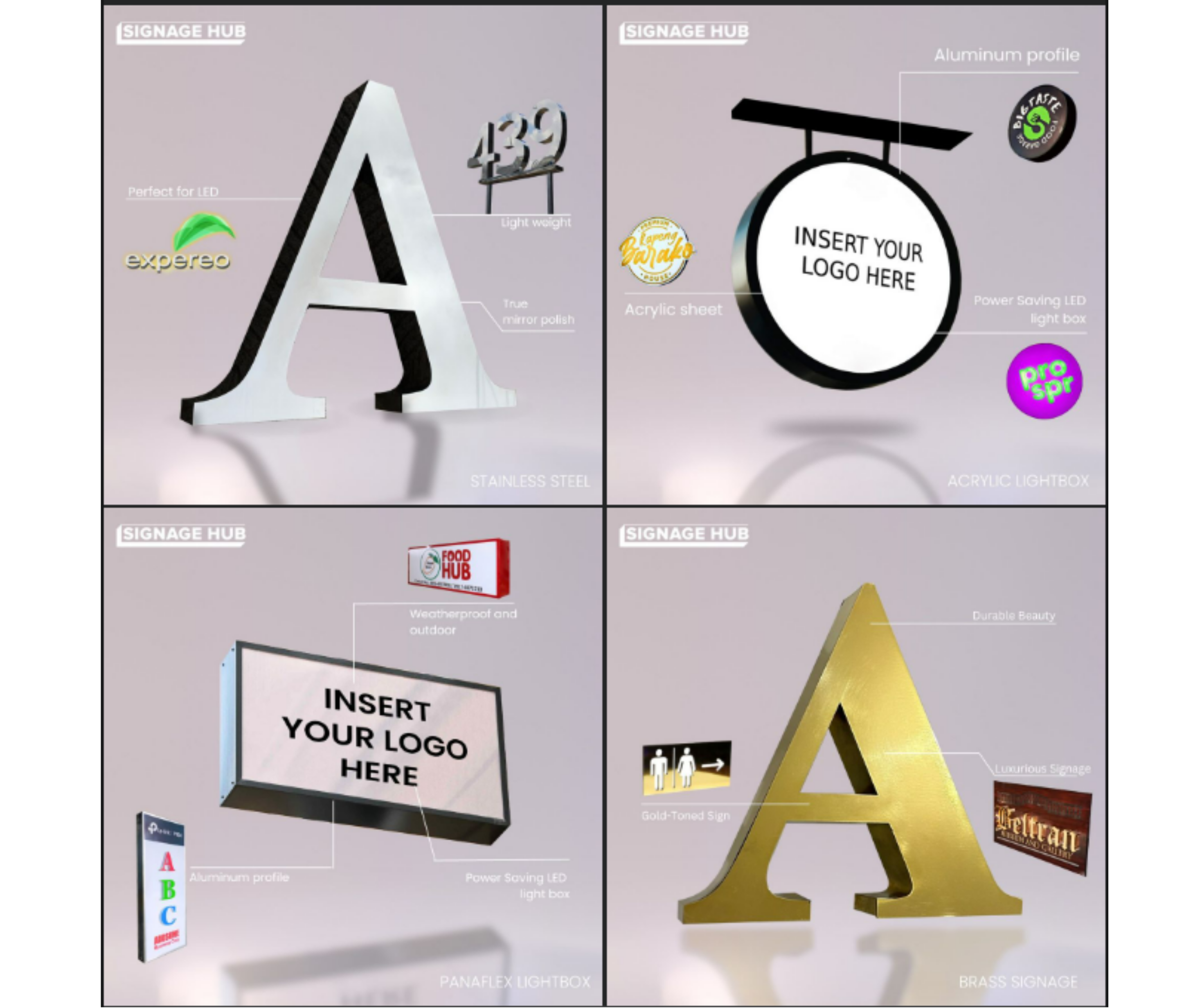
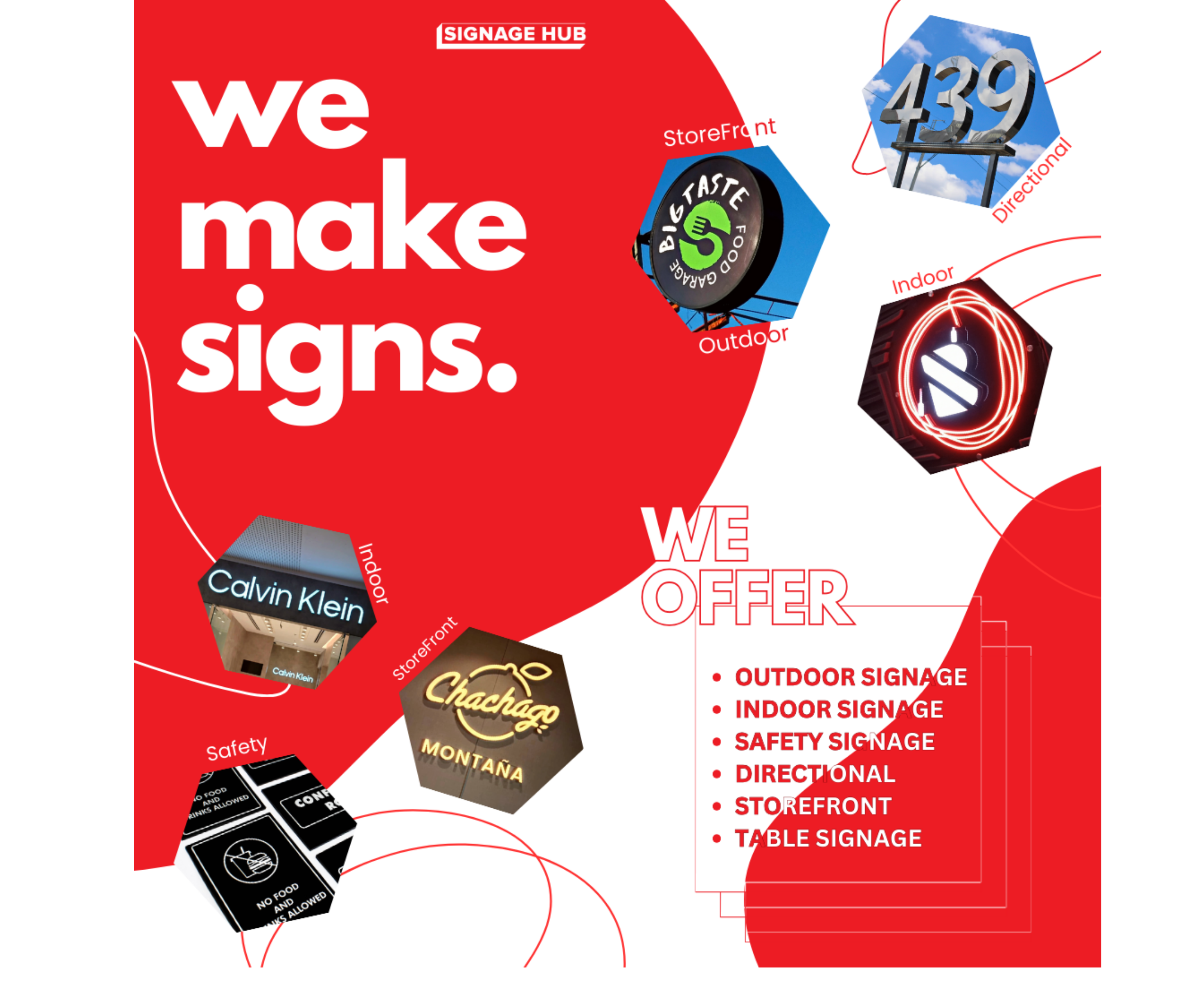
Signage Hub — Material Showcase
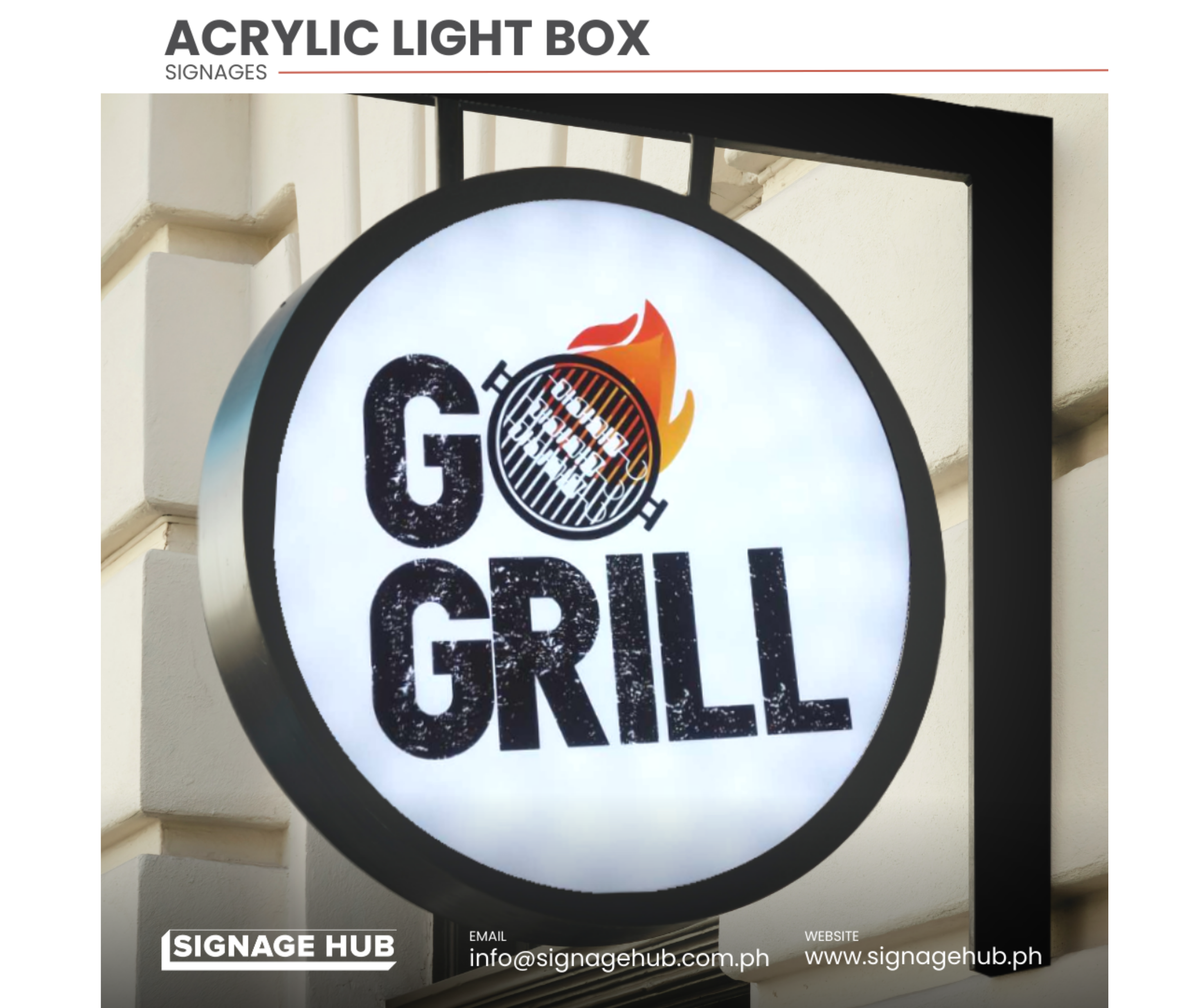
To show off different signage materials and what a client actually gets with each, the ad was split into a 4-tile format — one per material (stainless steel, acrylic lightbox, panaflex, brass) — each labeled with its key advantage, and paired with cut-out photos of real past client signage.
 Tap for details
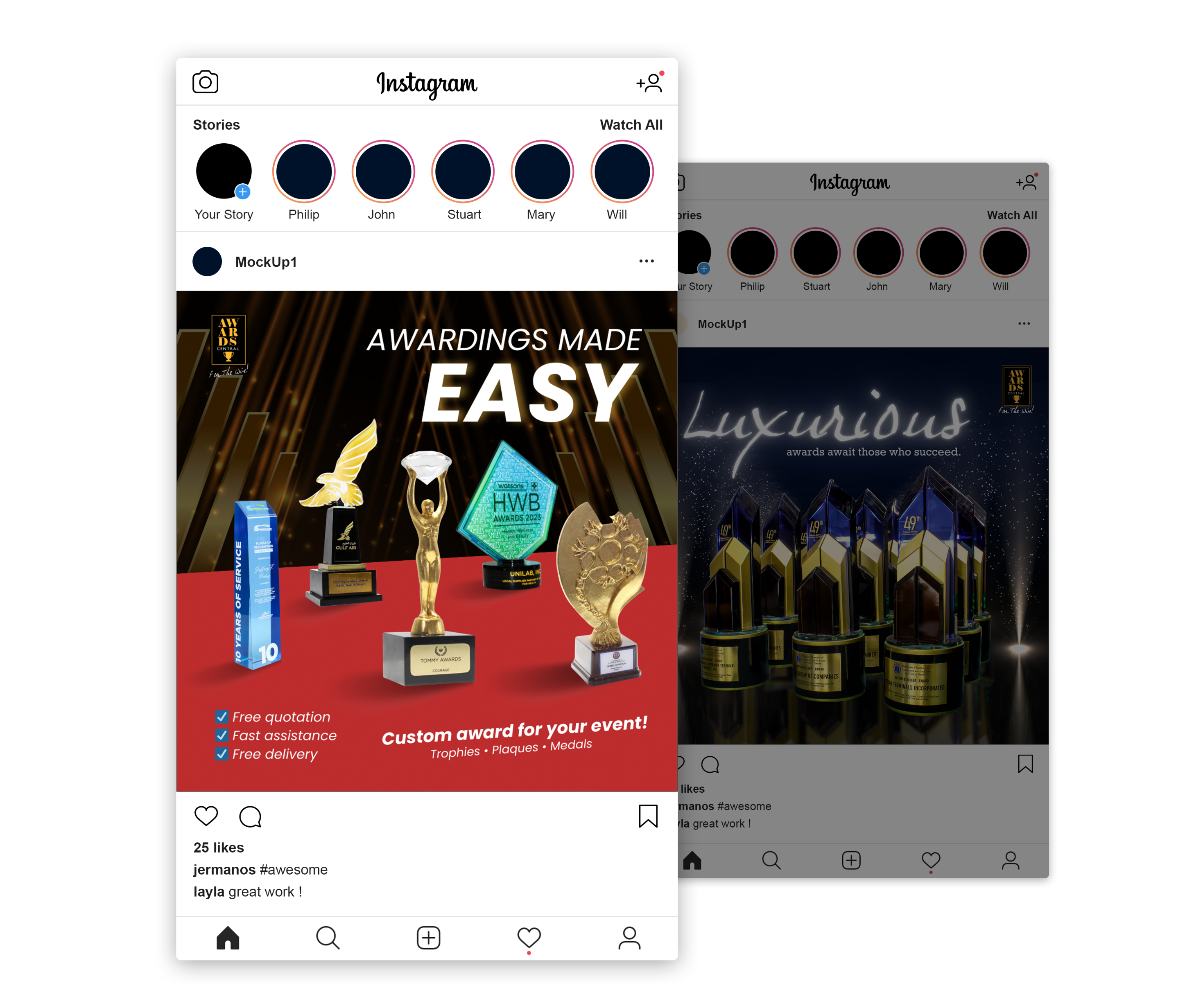
Awards Central PH — Awardings Made Easy
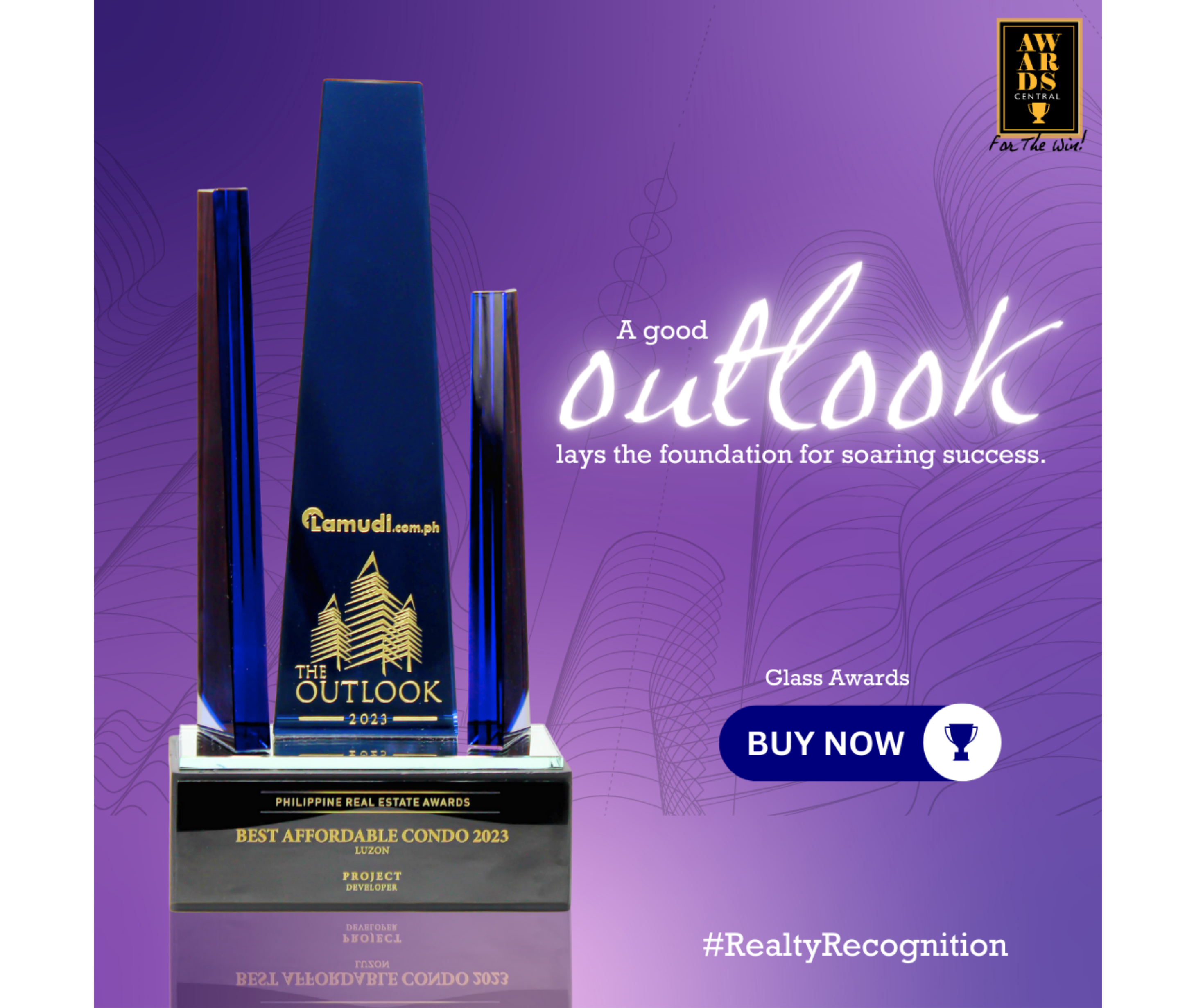
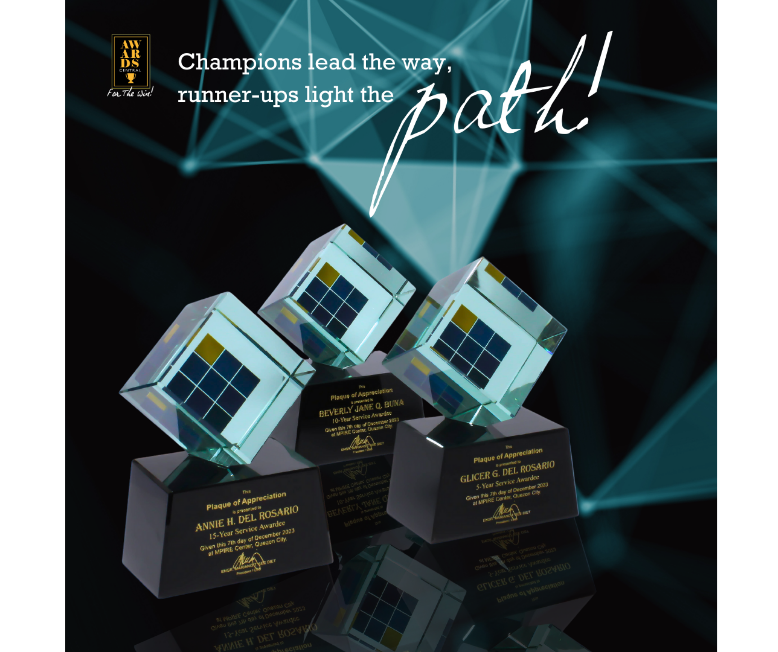
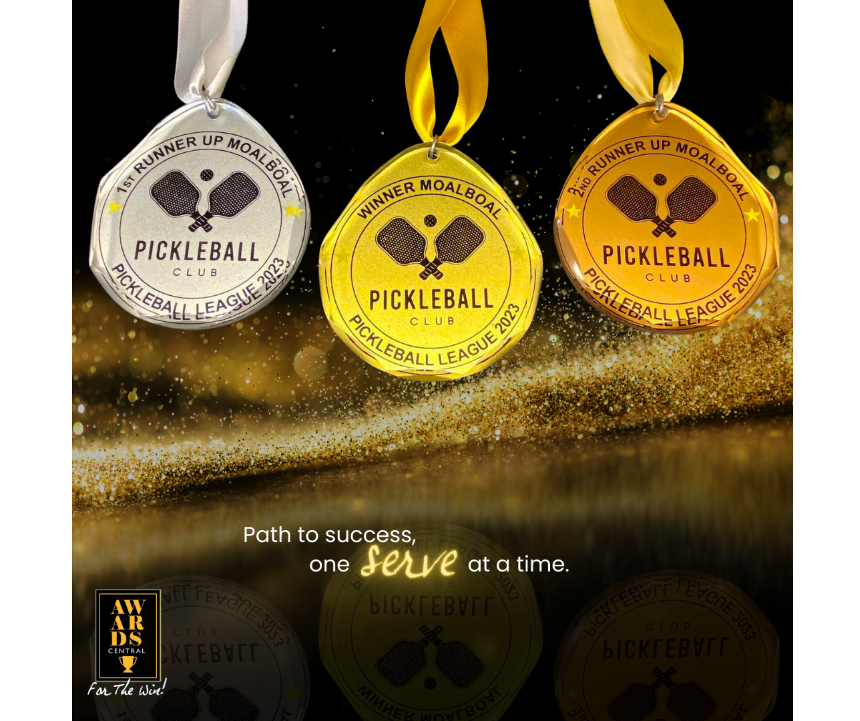
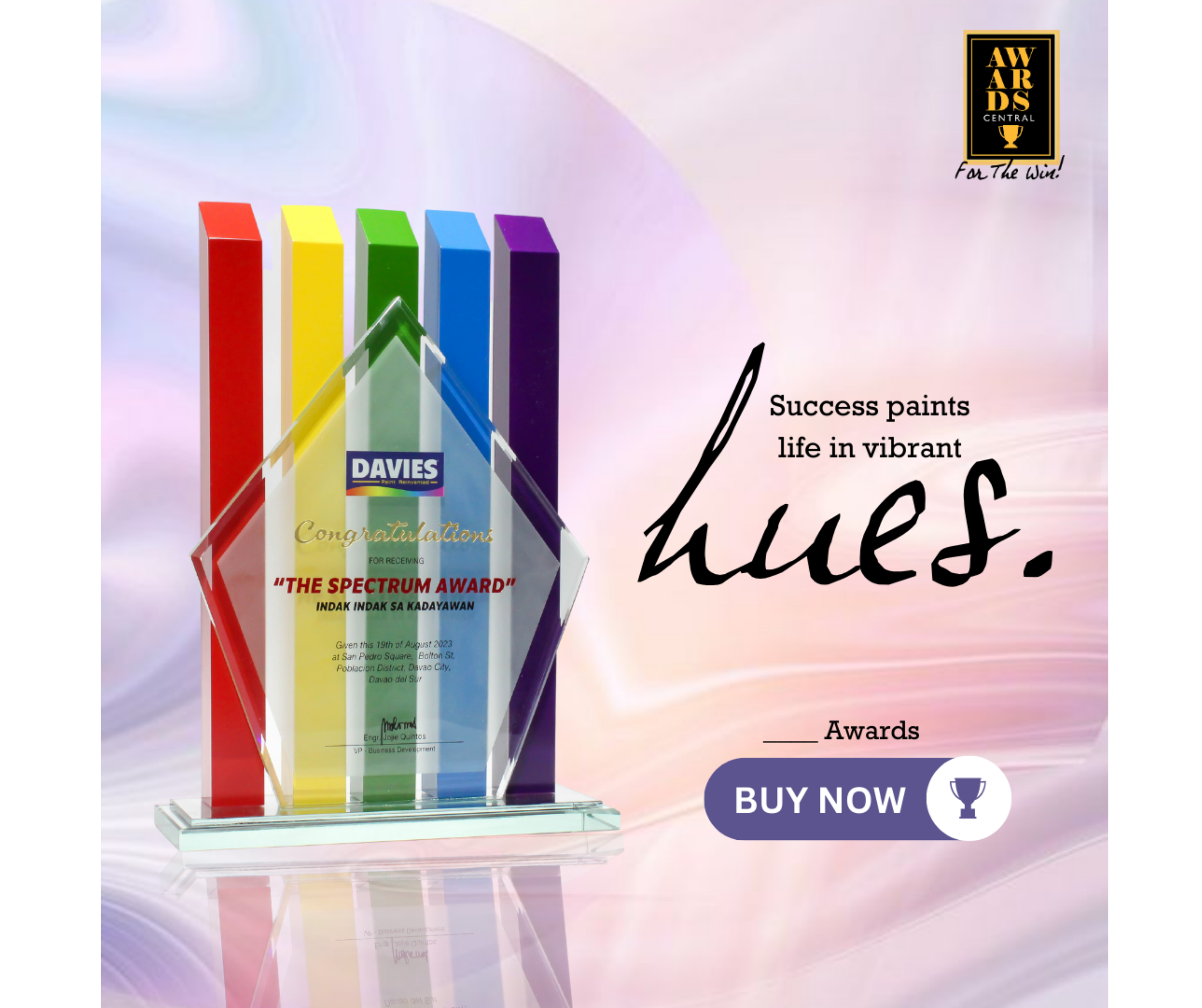
To position custom award-making as a premium service, the ad used a red carpet backdrop with a curated blue, gold, and black trophy palette, paired with copy spelling out exactly what clients get — free quotation, fast assistance, and free delivery.
 Tap for details
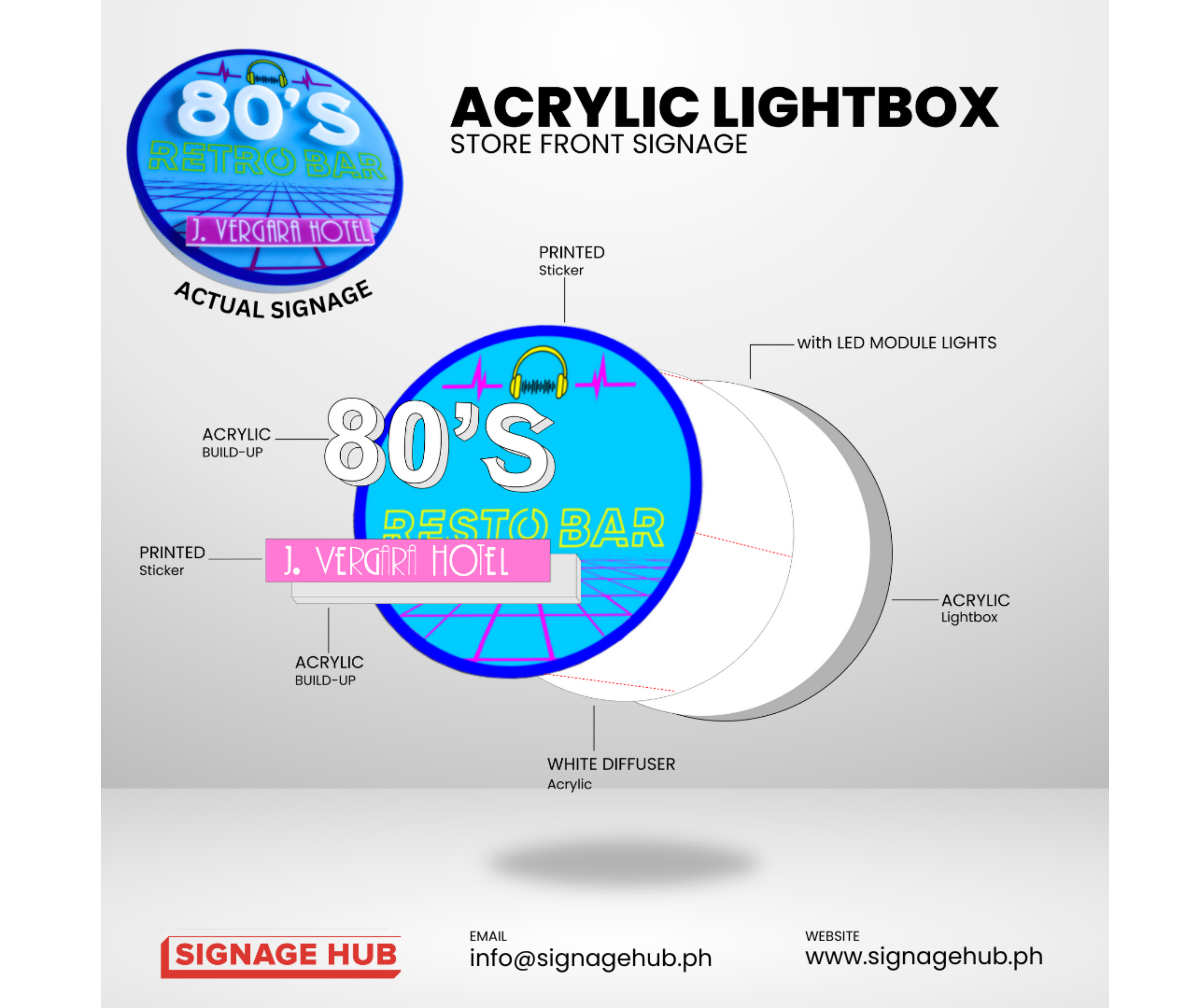
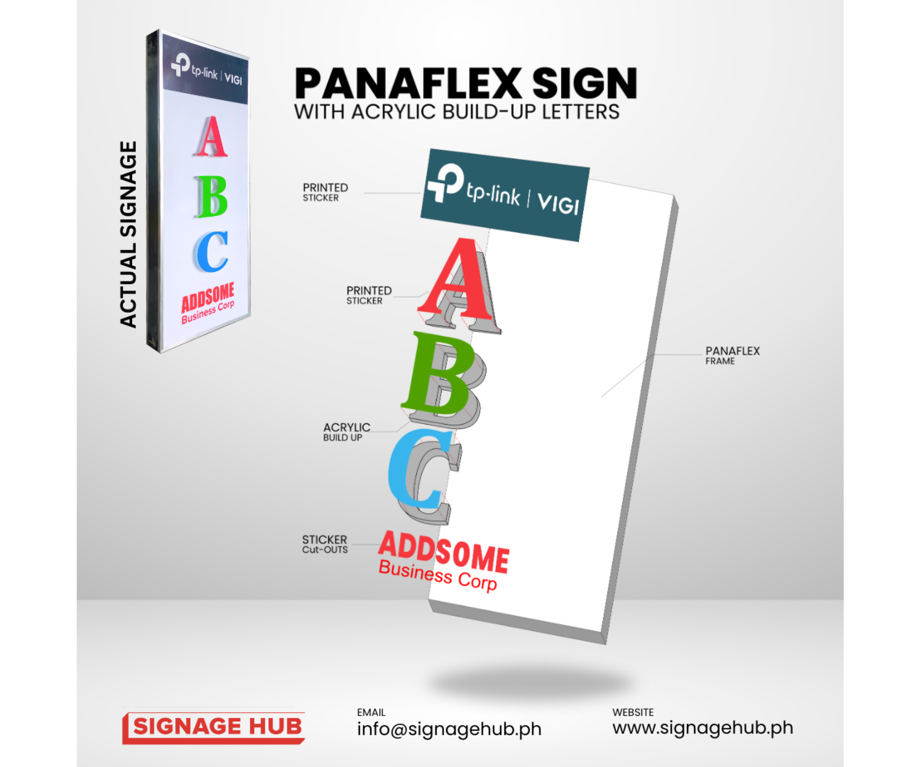
Signage Hub — Exploded View Diagram
To help potential clients understand what's actually inside a signage piece, this post breaks it down into an exploded assembly diagram — laid out in CorelDraw with each layer labeled (acrylic build-up, printed sticker, LED module, diffuser), alongside the actual finished signage shown in the top corner for reference.
 Tap for details
Awards Central PH — New Showroom Teaser
To tease an upcoming branch with a mysterious, product-first feel, the post frames one of the brand's signature trophies peeking out from the shadow, paired with the line "A New Place for Winners" hinting at the new location without giving too much away.
 Tap for details
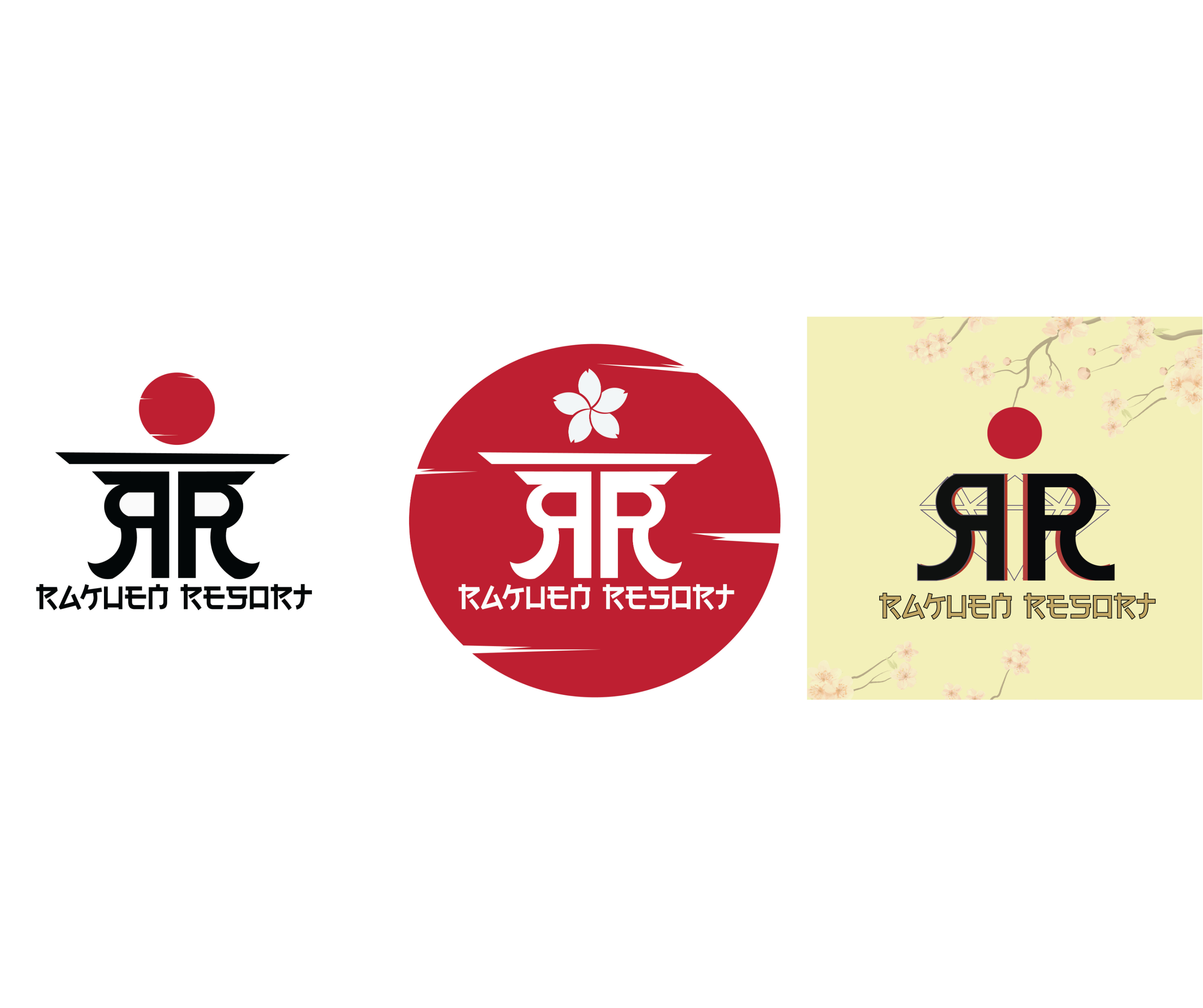
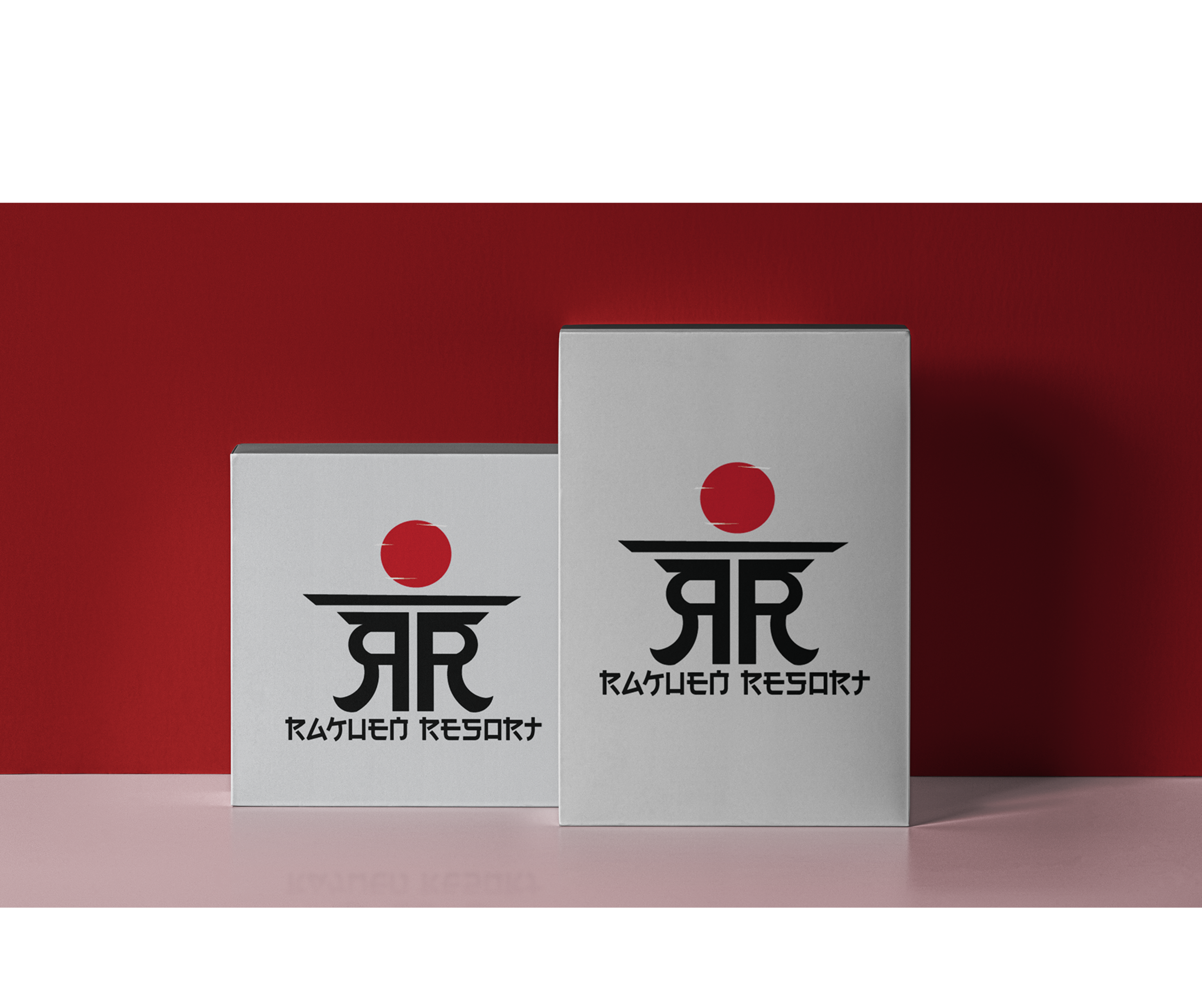
Rakuen Resort — Logo Design
For a Japanese-inspired resort brand, three logo directions were built around Japan's flag motif — a red circle — with the RR mark curved into an arc shape across each variation. The typeface itself was the client's own pick, applied consistently across all three.












.png)
.png)
.png)
.png)
.png)
.png)