Email Marketing Layout
Complete email marketing campaign with mobile and desktop variations.
Open FigmaFrom interactive bots to polished user interfaces. I combine graphich design with front-end craftsmanship to deliver thoughtful, maintainable products.
See ResumeHello! My name is Chariedale Joy Valdez. I am a Graphic Designer and a passionate developer. My work focuses on creating clean, efficient, and intuitive applications that solve real problems.
My background blends graphic design, Web UX/UI thinking, and full-stack development, allowing me to move fluidly between visual direction and technical implementation. I enjoy turning abstract ideas into clear, functional experiences that feel effortless on the surface but are carefully engineered underneath.
Complete email marketing campaign with mobile and desktop variations.
Open Figma
Elegant Homepage for Luxurious Business made purely on Figma
Open Preview Open Figma
Minimalist single-page site for dashboards, automations and video documentation. Built with Tailwind + HTML; deployed on Vercel.
View Live
A start up company that leans on modern tech style design. Created using Wix but with custom coded backend and templates.
View Website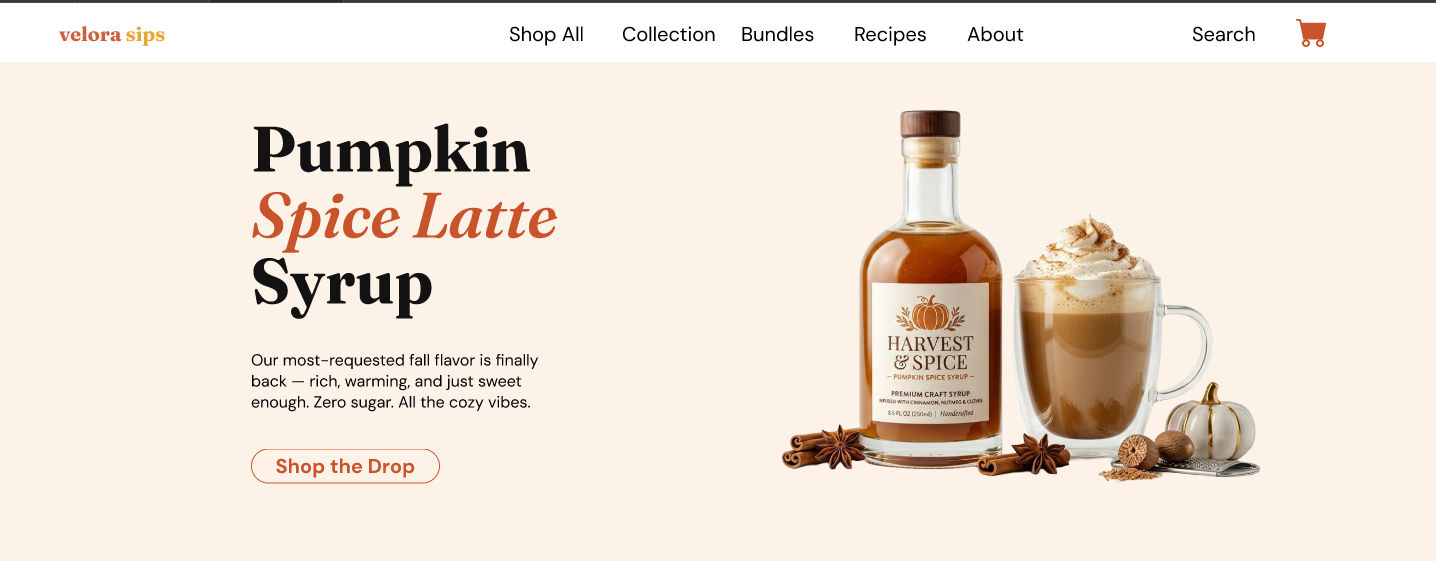
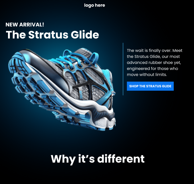
A full e-commerce homepage concept for a fictional flavored syrup brand. Designed in Figma with a warm terracotta palette, product sections, reviews, and bundle layouts.
Open PreviewObjective: To reduce mobile user drop-off and increase the rate of cart additions from the Product Detail Page (PDP).
Hypothesis: Adding a sticky "Add to Cart" button on the mobile PDP will improve the conversion rate by reducing friction and providing a clear path to purchase.
Test Variables:
Variant A (Original): Default mobile product page with a standard "Add to Cart" button.
Variant B (Variant 1): A new sticky "Add to Cart" bar was added to the bottom of the mobile PDP, including the product name and price.
Implementation: The test was conducted on mobile devices for both new and returning visitors. The sticky "Add to Cart" button was created using custom CSS.
KPI: Add-to-cart rate (CVR) and Revenue Per Visitor (RPV).
Results: The test resulted in a significant improvement, with a +19.0% lift in Revenue per Visitor (RPV) and a 90.3% win chance. The test was highly successful but was relaunched due to the client changing their website theme.
Conclusion: The sticky "Add to Cart" button proved to be a highly effective design change, validating the hypothesis that reducing friction on mobile product pages leads to a substantial increase in conversion and revenue.
Objective: Increase revenue per visitor by improving product presentation and reducing purchase friction across mobile and desktop.
Hypothesis: By introducing bundle-focused merchandising and strategic confidence signals (stock indicators, popularity badges), customers would purchase more frequently and at higher order values.
Test Variables:
Multiple tests across 3 months including bundle visibility on product listing pages, stock indicators, popularity badges, homepage merchandising optimization, and price filtering improvements.
Implementation: Comprehensive CRO program combining Shopify customization, custom JavaScript for confidence signals, and merchandising layout optimization. Tests ran on 22% of total traffic.
KPI: Revenue Per Visitor (RPV), Average Order Value (AOV), and Conversion Rate.
Results: Revenue Per Visitor increased by 11.4% over 3 months, Average Order Value increased by 12.9% at peak, By final month, CRO-influenced experiences drove 60% of all conversions, CRO traffic (22% of sessions) generated 37% of total revenue
Conclusion: This multi-test CRO program demonstrated that strategic funnel optimization can create lasting structural improvements in monetization. The progression from behavior change to conversion protection to revenue scaling validated CRO as a repeatable growth lever rather than isolated test wins.
Objective: To increase the number of checkout starts by leveraging a behavioral bias of urgency and loss aversion.
Hypothesis: Adding a real-time timer with a discount message to the cart page would lead to more users beginning the checkout process faster.
Test Variables:
Variant A (Original): The original cart page with no countdown timer.
Variant B (Variant 1): A 10-minute countdown timer with a promotional overlay was added to the cart page.
Implementation: A custom application code for the countdown timer was added to the client's Shopify liquid file.
KPI: Checkout start rate.
Results: The results of the test showed no significant difference, with the variant having a win chance of 50%. The test duration was from 2025-07-02 to 2025-07-16.
Conclusion: While the countdown timer did not produce a measurable increase in checkout starts, this test provided valuable insights into user behavior. The data gathered from this test serves as a strong foundation for future, more targeted experiments to find an effective way to leverage urgency.
Objective: To reduce friction and improve engagement beyond the hero section of the homepage.
Hypothesis: If homepage animation is reduced, users will stay longer and engage more with content blocks.
Test Variables:
Variant A (Original): The homepage with an animated hero banner.
Variant B (Variant 1): The variant was a simplified design that included a static hero banner with a faster load time.
Implementation: This test was implemented on desktop users with a 50/50 traffic split. The changes for the variant involved removing video blocks from the product grid, eliminating redundant testimonial sections, and removing an animated marquee strip to reduce visual clutter and streamline the layout.
KPI: Bounce rate, scroll percentage, and clicks on modules below the fold.
Results: After running for a week, the test showed a significant win for Variant B, with a 65% win chance and a 5% lift in scroll percentage.
Conclusion: The hypothesis was validated. By reducing visual clutter and friction on the homepage, the simplified design of Variant B successfully improved user engagement, leading to a higher scroll depth and more interaction with the content below the fold.
Beyond code — a collection of visual work spanning brand identity, social media content, advertising, and video production.
View Graphic Design